

Democrats now favorites to win both the House and the Senate
Plus: only half of Ukrainian refugees wish to return, lower-ranked US colleges have shrunk, and more

Democrats now favorites to win both the House and the Senate
Lower-ranked American colleges have lost nearly half their students
American companies are diverging, but consumer spending and incomes aren’t
In brief: violent protests in Cuba, new carbon footprint calculator, and more
Democrats now favorites to win both the House and the Senate
Forecasters have long expected a split result in the November midterm elections, with Democrats flipping the House and Republicans holding the Senate. But in the last month, Democrats’ chances of taking the Senate have risen steeply, on the back of falling approval ratings for Donald Trump.

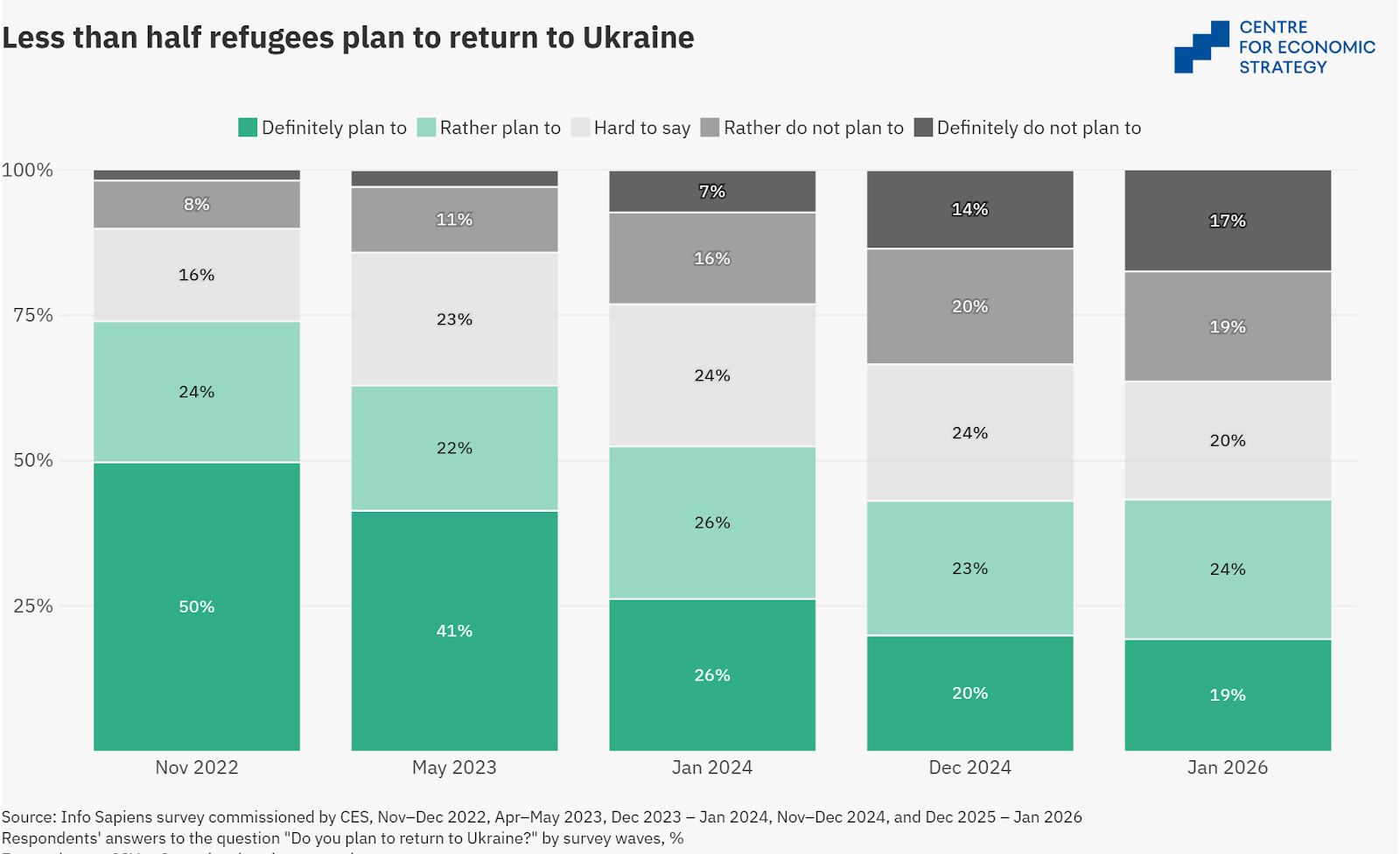
Only half of Ukrainian refugees wish to return
Since Russia’s invasion, Ukraine’s population is estimated to have declined from 41 to roughly 31 million, as people have fled or died and fertility has fallen. How much could it recover if the war came to an end? Modestly, if a recent survey of refugees (excluding those in Russia and Belarus) is correct. Only 43 percent say they wish to return to Ukraine after the war, whereas 36 percent say they would prefer not to.
Lower-ranked American colleges have lost nearly half their students
Since 2010, the number of students at American universities has fallen.
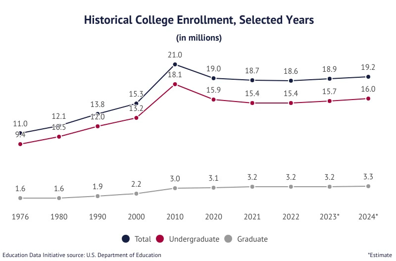
As the American Enterprise Institute’s Preston Cooper shows, the decline has been uneven. While enrollment has held up at the top 40 percent of institutions – as measured by completion rates and economic outcomes – it has plummeted at middle- and low-ranking institutions.
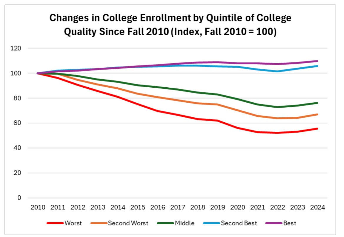
Source: Preston Cooper, American Enterprise Institute
American companies are diverging, but consumer spending and incomes aren’t
In recent years, many have described the American economy as K-shaped, with one group pulling ahead and another falling behind, like the two diverging arms of the letter K. But is this true? When it comes to companies, yes. As Stripe’s chief economist Ernie Tedeschi shows, the most profitable firms have increased their share of the stock market.
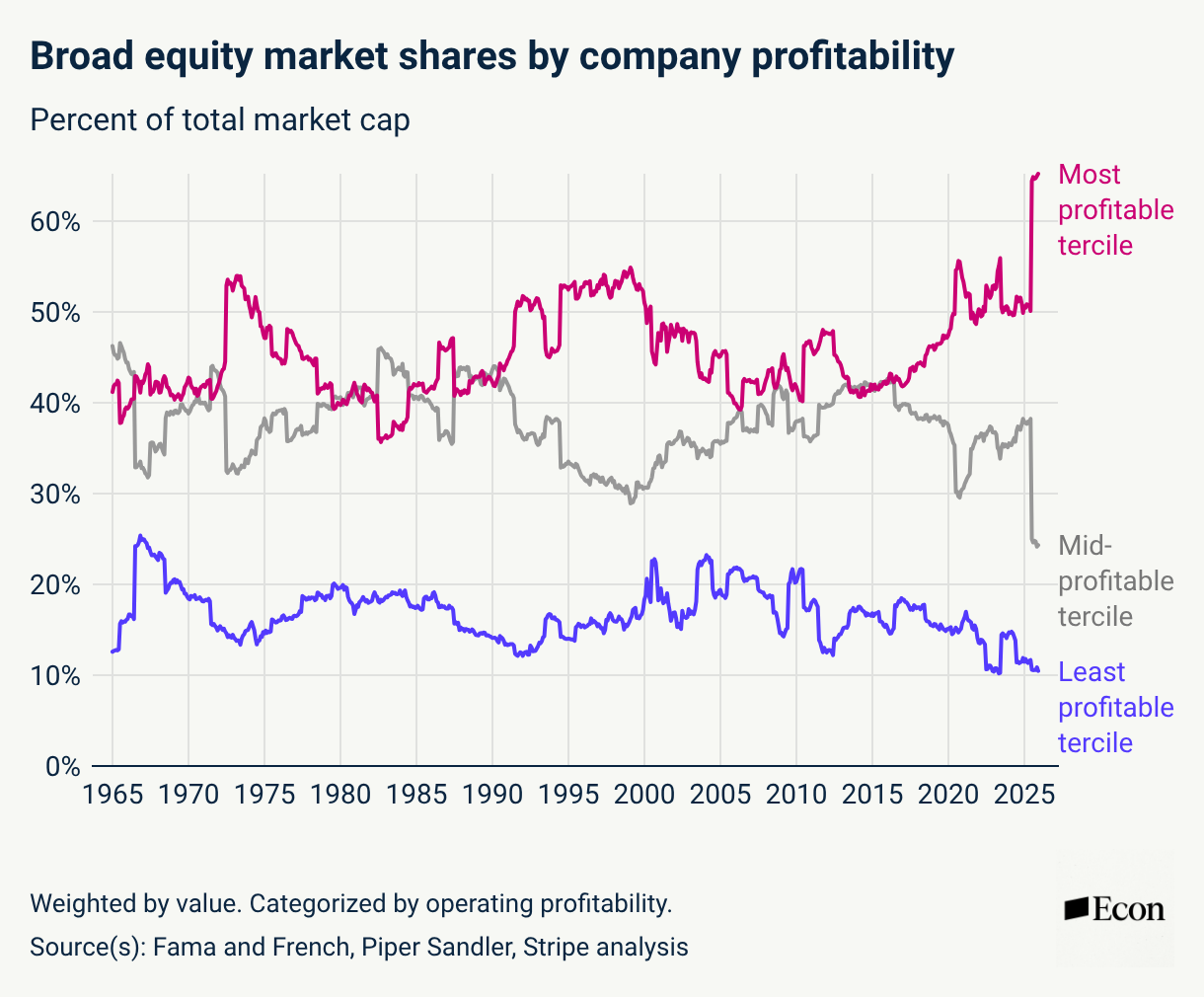
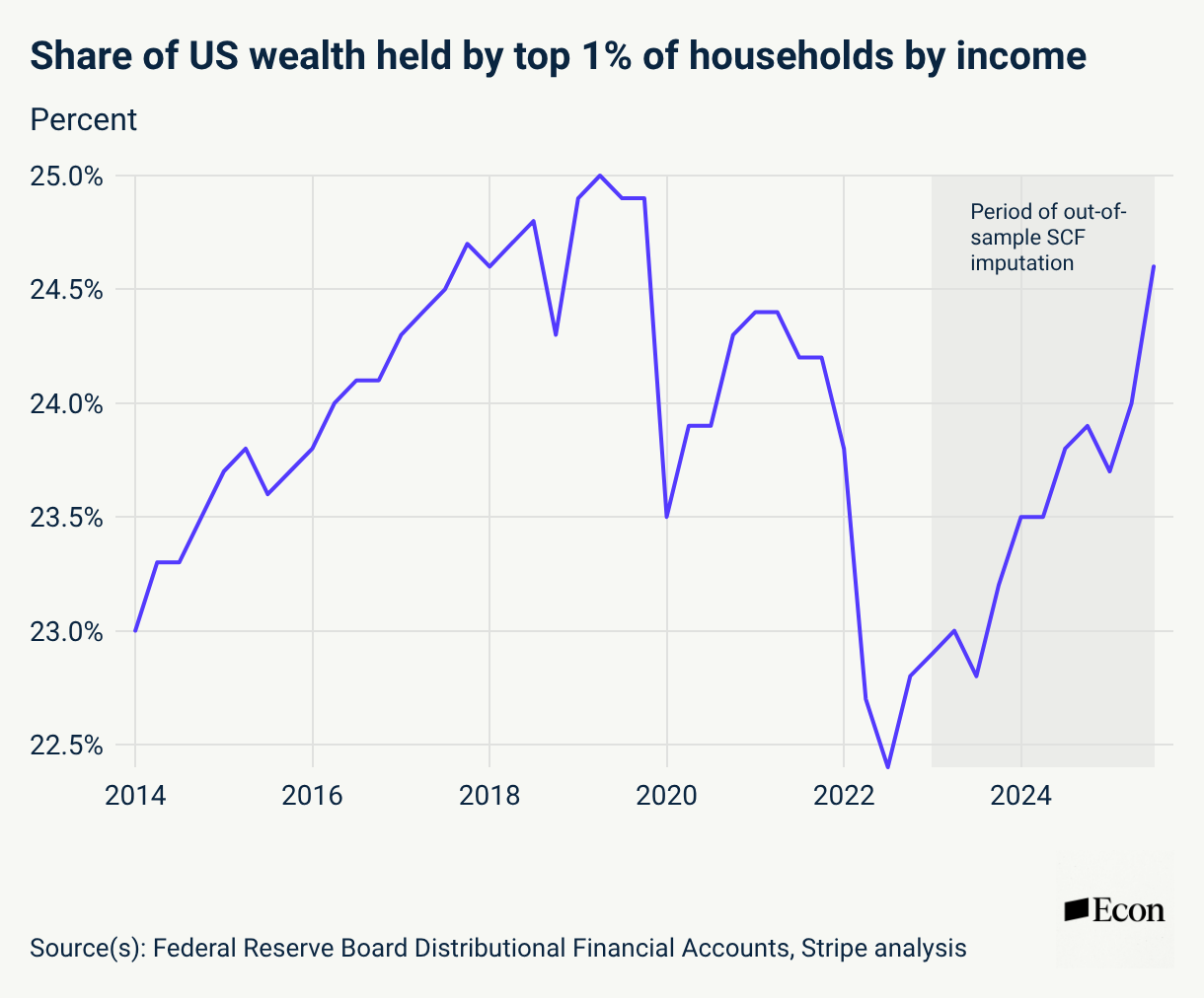
Household wealth has also become more concentrated at the top, likely driven by the strong stock market.
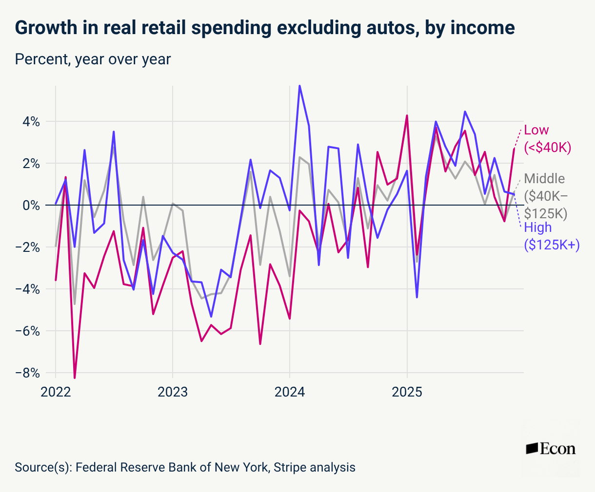
But spending growth has been relatively equal across the income distribution.
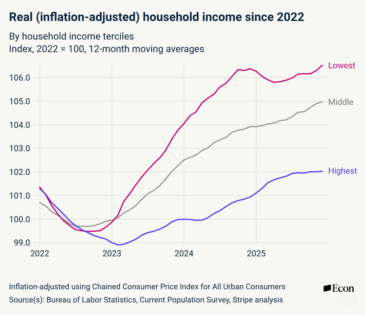
And incomes have actually converged: the lowest third has done the best, and the highest the worst. As Ernie argues, lower earners have likely benefited disproportionately from the tight labor market.
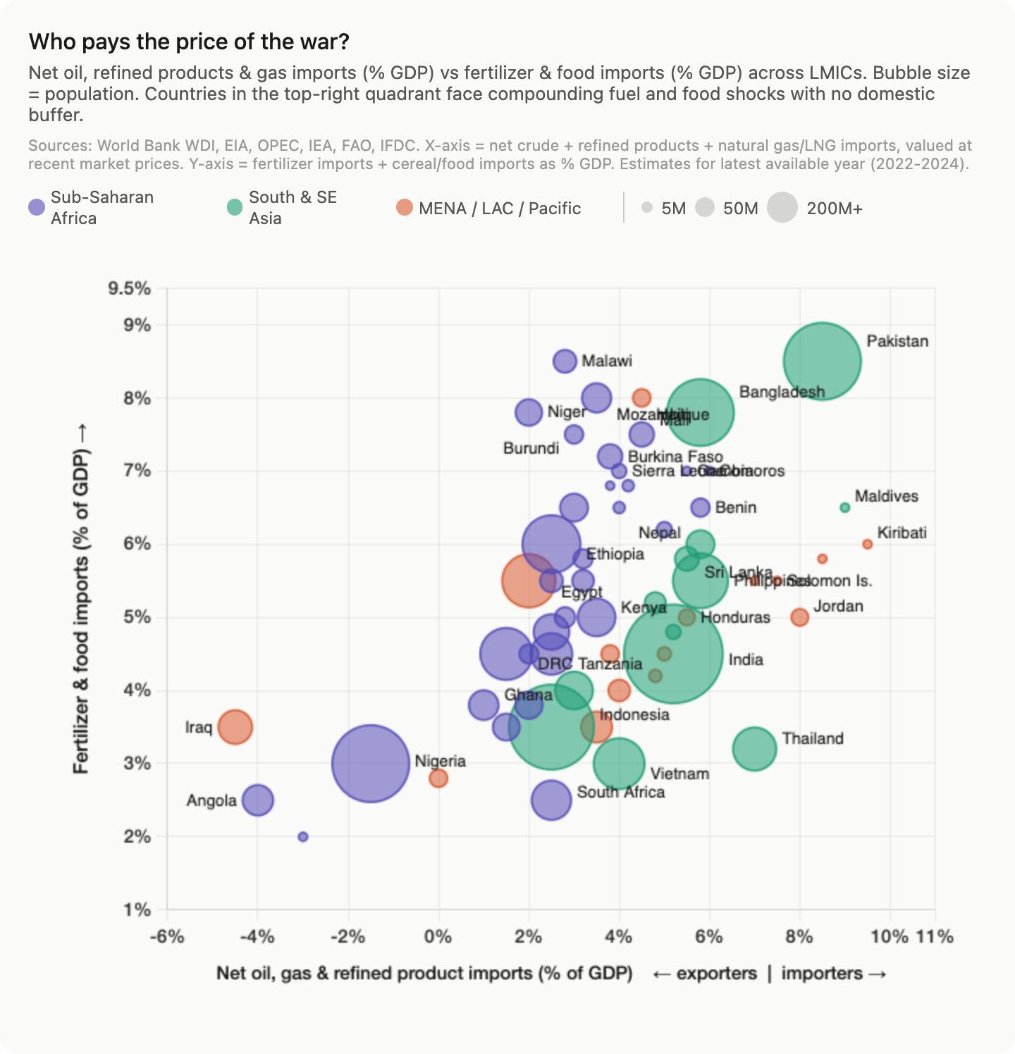
Shipping in the Strait of Hormuz has collapsed
Despite Donald Trump’s call for ship captains to ‘show some guts’, few of them dare to risk an Iranian attack in the Strait of Hormuz.
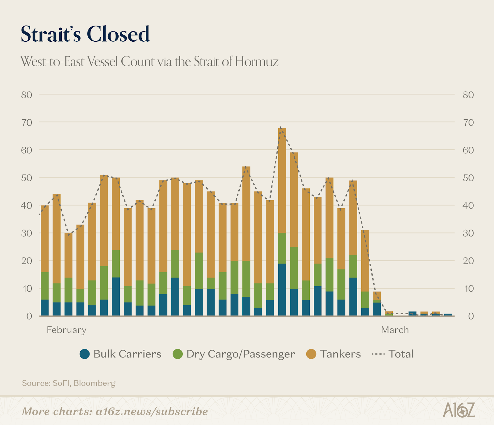

Since a large share of vital commodities such as oil and fertilizer is transported through the Strait of Hormuz, the world economy could be disrupted if it remained closed.
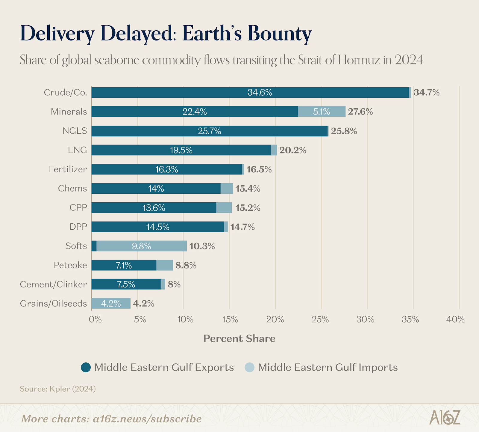
In particular, many low- and lower-middle-income countries stand to suffer.
Markets expect a short war in Iran
But in fact, oil futures suggest markets don’t think the war will last very long. While a barrel of Brent crude costs more than $100 if delivered in May, contracts for delivery later this year are much cheaper.
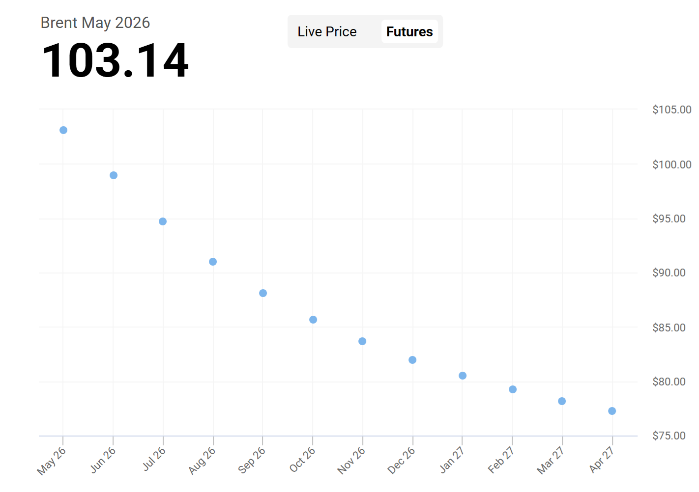
In line with this, inflation expectations haven’t followed the oil price the way they usually do.

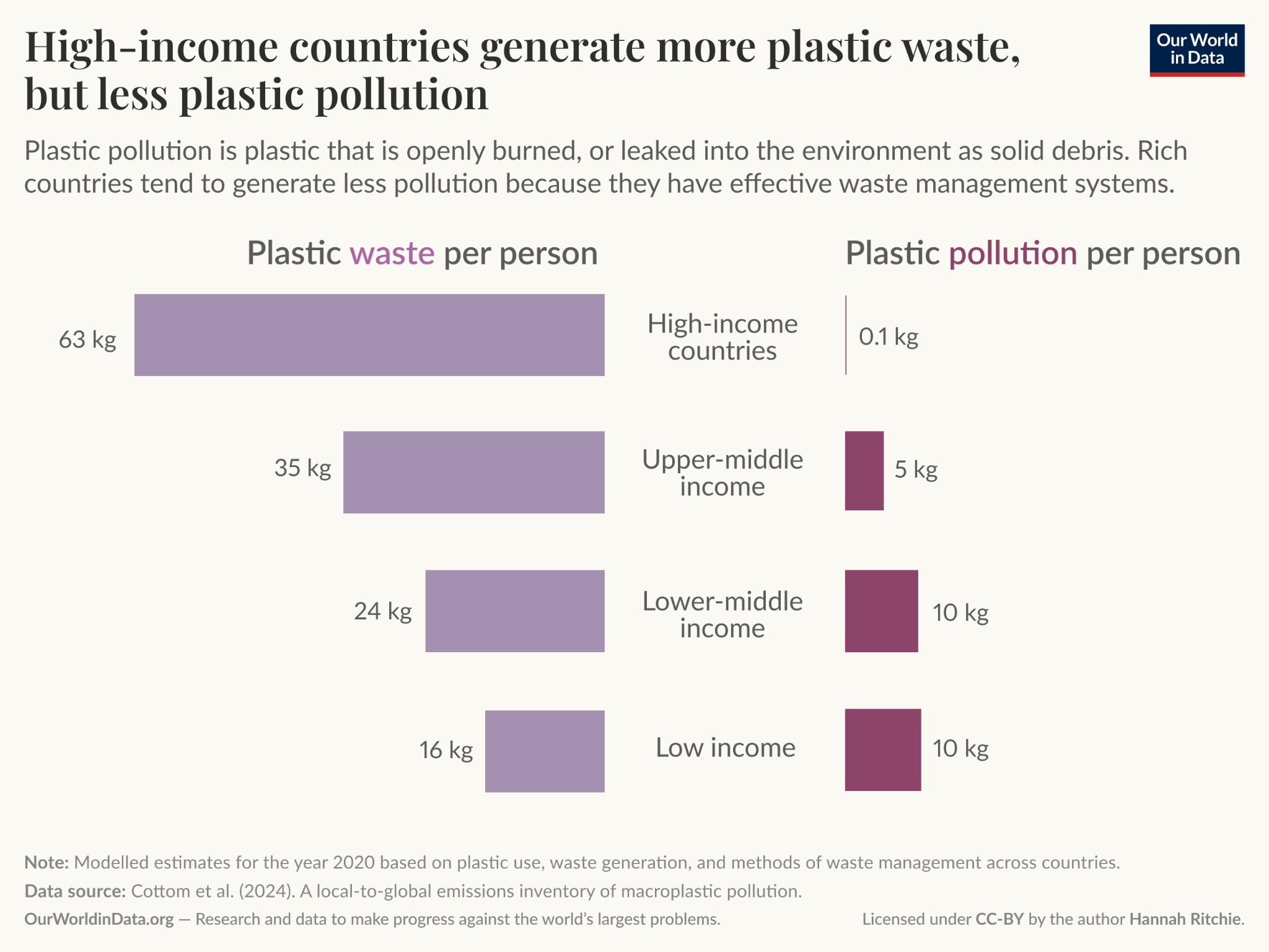
Richer countries generate much less plastic pollution
The degrowth movement argues that economic growth is bad for the environment and that we therefore need to shrink our economies. But this isn’t right. Richer countries are in many ways better at protecting the environment. For instance, they generate far less plastic pollution even though they use more plastics.
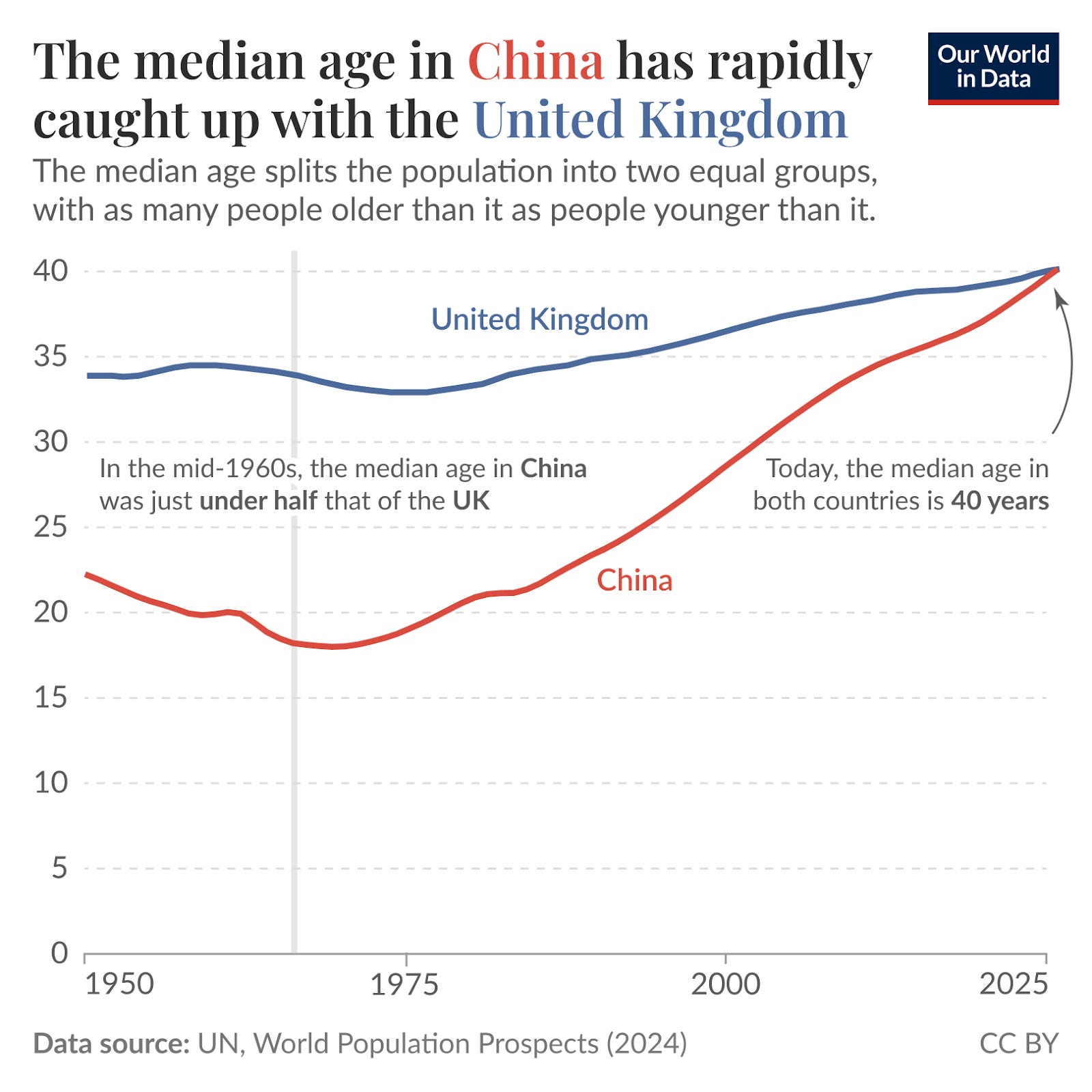
China is aging fast
In 1965, China had a very young population with a median age of just 18. But since then, it has aged rapidly due to falling birth rates and increasing life expectancy. China’s median age has caught up with the UK’s and is projected to be ten years higher in 2050.
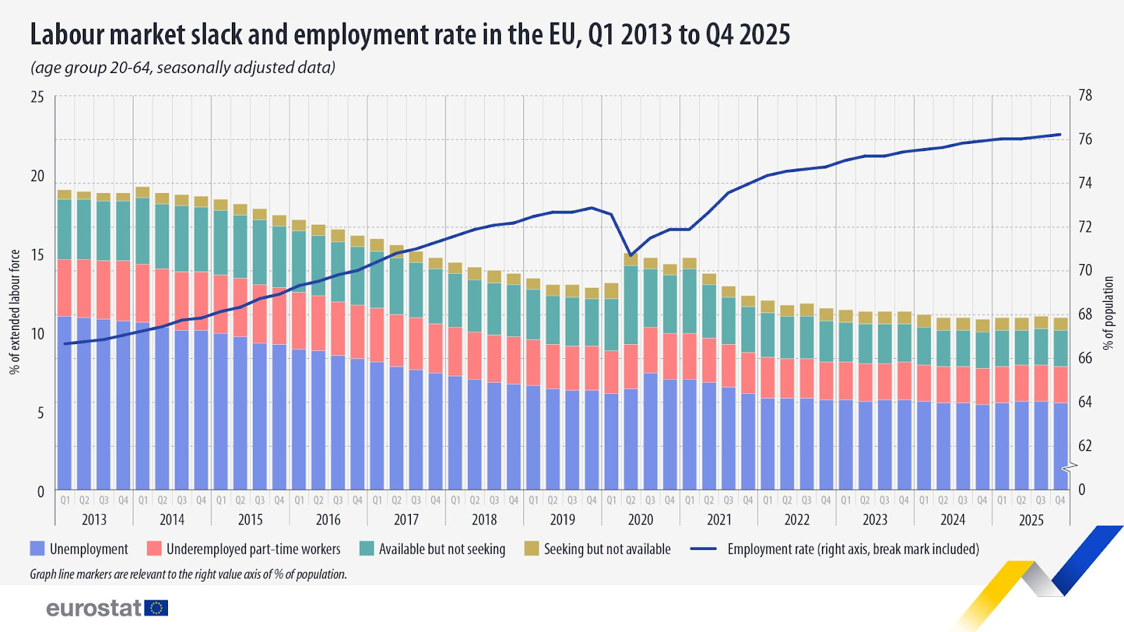
The EU employment rate keeps climbing
In the EU, the employment rate of people aged 20–64 hit a new record of 76.3 percent in the last quarter of 2025, thanks to increases in southern Europe. Likewise, unemployment and underemployment are at record lows.
In brief
Andy Masley has put together a calculator for your personal carbon emissions
Astera Institute commits $500 million to research infrastructure for the life sciences
American growth revised to 0.7 percent in Q4, sharply down from Q3
Ethan Mollick: ‘Comments on my posts are no longer worth reading due to AI bots. That was not the case a few months ago.’
AI lab founders hold smaller shares of their companies than the Google and Facebook founders did
Sentinel forecasters think major US attacks on Iran will cease on 19th April
This is a great article, but I am not sure your chart really supports your statement “Since 2010, the number of students at American universities has fallen”
Your chart shows a pretty significant outlier at 2010, which reverts to a flattening trend, but not shrinking.
Maybe if it were expressed as a percentage of school-age population it would be more clear.
Picking an outlier and then saying it is shrinking relative to that is less convincing.
I am curious what your thoughts on the wishful thinking essay are